the real atlas: sad analogous observations
i came across this on telegraph, a news site out of the uk. it’s a really fascinating map software that depicts the nations of the world, not by their physical size, but by their demographic importance on a range of subjects. there are some interesting analogous observations that really aren’t that difficult to make.
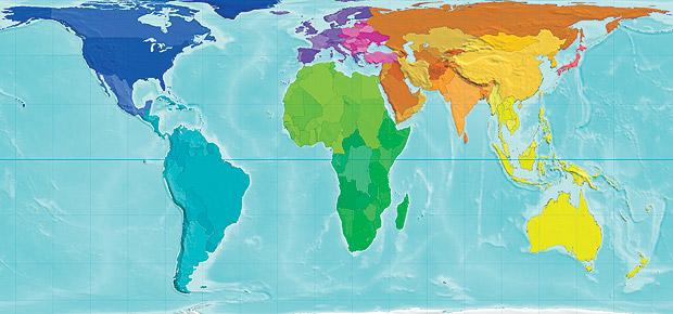
now, on to the issues.
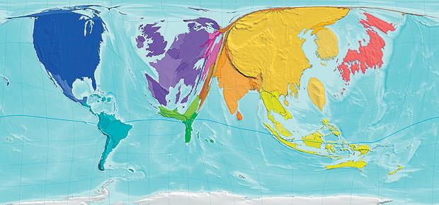
first, here’s a map showing the projected wealth distribution by the year 2015. observations: united states is enormously larger than the “standard” map. china is the largest percentage. in contrast, notice that africa is barely visible (particularly in comparison to the “standard” map above.
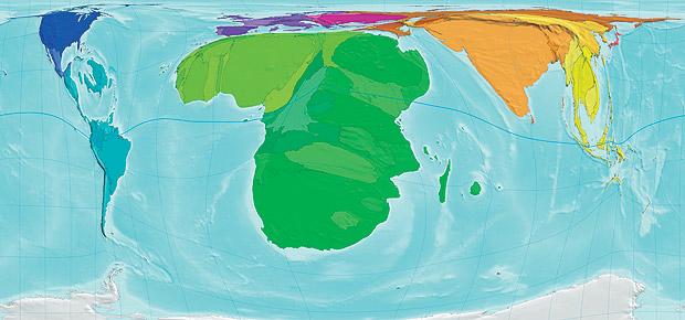
let’s make a sadly analogous observation concerning this map that shows the percentage of hiv victims throughout the world. observations: both the united states and china—the wealthiest nations—are barely visible. on the other hand, africa—the poorest nation—has no other comparison in the world in terms of people with hiv.
third, here’s a map showing the nuclear weapons in the world. observations: of all categories, this the one in which the united states is the biggest. russia, our “enemy”, is right there with us. on the other hand, the vast majority of the world isn’t even represented on this map. no africa. barely china. barely india. barely southeast asia.
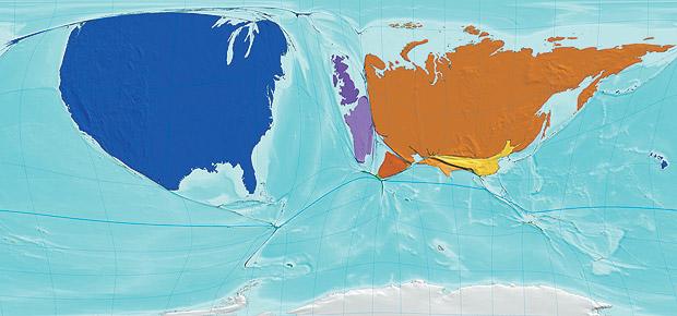
this final map shows another sad contrast to the previous map. it depicts the number of war deaths over the last 50 years. observations: biggest nuclear owners, america and russia, barely visible. people with no or very little nukes: africa, china, southeast asia, india. mass death.
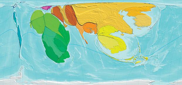
i’ll let you draw your own analogies and conclusions…very sad…


